Typography is one of the key fundamental aspects of design that often goes unnoticed. But choosing the right font for your website can make all the difference between creating an impressive site or just another mediocre site.
Typography is not merely about selecting aesthetically pleasing letters; it’s about effectively communicating your brand message and guiding users through their online journey.
Whether you’re designing a sleek e-commerce platform or an informative blog, understanding how fonts impact user behavior is essential.
The Importance of Typography in Web Design
Typography is a critical element of web design, with far-reaching impacts beyond its visual appeal. It serves as a powerful tool that can evoke emotions, convey messages, and enhance the overall user experience. Effective typography can capture attention, establish hierarchy, and guide users through content.
The importance of typography in web design is due to its impact on user behavior. Studies have shown that font choice can influence how users perceive and interact with websites. For instance, a clean and easy-to-read font instills trust and credibility, while a bold and expressive font might evoke excitement or urgency.
Typography also contributes to branding efforts by creating a distinct identity for your website. Consistency in font usage across different pages helps reinforce brand recognition and promotes familiarity among users. By carefully selecting fonts that align with your brand values, you can create a visual language that resonates with your target audience.
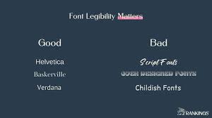
Moreover, typography plays a vital role in improving the readability and accessibility of your website’s content. Appropriate font choices, with ample spacing between letters and clear distinction between characters, can significantly enhance legibility for all users, including those with visual impairments.
Understanding Different Types of Fonts
When you are designing a website it is important to understand the different types of fonts and their characteristics to make informed decisions when selecting the font.
The four main categories of fonts are serif, sans-serif, script, and display. Serif fonts have small decorative lines or flourishes at the ends of each letter, giving them a more traditional and formal look.
- Sans-serif – They offer a clean and modern feel, without extra embellishments.
- Script – They mimic handwriting styles with flowing strokes that add elegance to a design.
- Display fonts – They are highly stylized and often used for headlines or logos to create impact.
Each type has its unique personality, which should align with the overall branding and purpose of your website.
When selecting a font, it’s vital to consider readability across different devices and screen sizes. Fonts that are too small or intricate may be difficult to read on mobile devices while larger screens can handle more elaborate designs. Also, consider how legible your chosen font is in both upper-case and lower-case characters, as well as in bold or italic variations if needed.
While fancy or trendy fonts may seem like a good choice for visual appeal, it’s always best to prioritize usability over aesthetics. A user-friendly website ensures visitors stay engaged longer, not just have fancy looks.
Factors to Consider When Choosing a Font for Your Website
There are several factors that you need to consider to ensure that the chosen font enhances user experience while effectively communicating the brand’s message.
- Readability – It is the most crucial factor. Your font should be legible and easy on the eyes, especially when users are reading lengthy text.
- Brand – The style and tone of your website also play a vital role in font selection. Your font should align with your brand identity and convey the right message to your audience. For instance, a clean and modern font may be more appropriate than a decorative script font for a professional business website.
- Audience – Consider the target demographic of your website as well. Different age groups have different typography preferences. Younger audiences may prefer trendy and unique fonts, while older audiences may prefer classic font options.
By considering these factors you can choose an aesthetically pleasing font suitable for your web design that can effectively communicate your brand’s message.
Top 5 Fonts for Websites
When it comes to choosing the right fonts for your website, there are countless options available. However, not all fonts are equal. Some are better suited for web design than others.
To help you narrow down your choices, here are our five top font picks that are widely used and highly recommended by web designers in general:
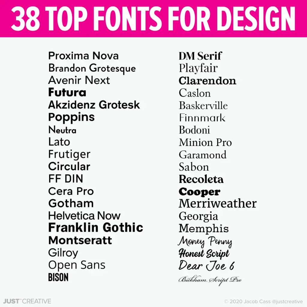
- Helvetica: This font is clean, versatile, and easy to read on screens of all sizes. It has a neutral appearance that makes it suitable for a wide range of professional websites.
- Arial: Similar to Helvetica in its simplicity and clarity, Arial is another popular choice among web designers. It offers good legibility both on desktops and mobile devices.
- Roboto: Developed by Google specifically for use in Android applications and websites, Roboto has become a favorite among designers due to its modern look and excellent readability.
- Open Sans: Known for its friendly yet professional vibe, Open Sans is an open-source font designed with accessibility in mind. Its versatility allows it to work well across different platforms.
- Lato: With its elegant curves and strong presence on the page, Lato adds a touch of modern sophistication to any website design while maintaining readability.
How to Pair Fonts Effectively
Here are some tips on how to pair fonts effectively.
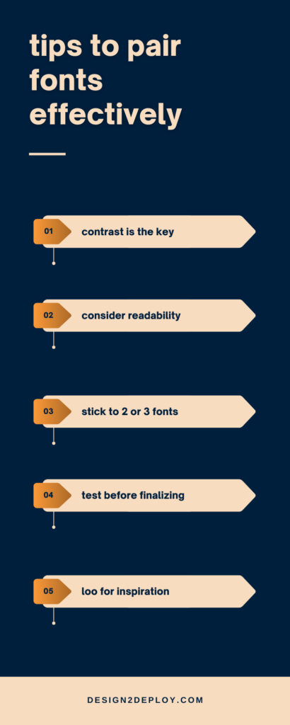
- Contrast is key: Pairing fonts that have contrasting characteristics can create visual interest. For example, combining a bold sans-serif font with a delicate script font can add balance and emphasis to your content.
- Consider readability: While contrast is important, it’s also essential to prioritize readability. Make sure both fonts are legible at different sizes and on various devices.
- Stick to two or three fonts: Using too many different fonts can make your design appear cluttered and unprofessional. Limit yourself to two or three complementary typefaces for a clean and professional look.
- Test before finalizing: Before settling on specific font pairings, test them out by using mockups or prototypes of your website design. This will allow you to see how they interact with other elements on the page.
- Look for inspiration: If you’re unsure about which fonts work well together, seek inspiration from existing designs or typography resources online.
By following these guidelines, you’ll be able to choose font combinations that not only enhance your website’s aesthetic appeal but also improve its usability and user experience.
User behaviour and statistics play a significant role in web design, therefore choosing the right font for your website is crucial. Typography not only affects the overall aesthetics of your site but also impacts user experience and brand perception.
By understanding different types of fonts and considering factors such as legibility, readability, and consistency with your branding, you can make informed decisions when selecting fonts for your website. Remember to choose fonts that reflect your brand personality while ensuring they are easy to read across different devices.