Creating an eye-catching website is crucial to grab your audience’s attention and keep them engaged. However, it’s equally important to ensure that your website looks good and functions seamlessly across all devices. And that’s where responsive images come in.
Have you ever visited a website on your mobile or tablet, and the images look blurry? As a user, it’s quite frustrating to use such sites.
In this blog post, we’ll see about using responsive images in websites and learn how they can transform the way we present visual content.
Understanding the Importance of Responsive Images in Web Design
Responsive web design is basically a web concept in which websites are designed and developed to adapt to different screen sizes. And at the core of this approach is the importance of responsive images.
Responsive images are not just about looks; they’re also about delivering a great user experience. People expect websites to look good and be easy to use no matter what device they’re on. By using responsive images, you can make sure your visuals (both images and graphics) stay clear and sharp on any screen.
In addition, loading speed is crucial for both users and search engines. Large image files in general can slow down your website, which can spoil the user experience. With responsive images, you can optimize file sizes for different devices without sacrificing quality or speed.

Users want websites to load quickly and be easy to use. Responsive images automatically adjust to different screen sizes, making it easy for people to browse your site.
Whether you’re selling products or showcasing your portfolio, understanding the importance of responsive images is key to creating a great website that meets the expectations of modern users.
The Basics of Responsive Images: What You Need to Know
If you’re a website owner or designer, then understanding the concept of responsive images is crucial.
Why is this important? Well, with the rise of mobile devices and different screen sizes, it’s essential to ensure that your website looks and performs well on all devices. By using responsive images, you can ensure that your visuals look sharp and clear on any screen, whether it’s a large desktop monitor or a small smartphone.
There are various techniques you can use to create responsive images, including CSS media queries and HTML’s srcset attribute. Additionally, there are many online tools and services available to help you optimize your images for performance without sacrificing quality.
However, implementing responsive images can sometimes present challenges, such as downloading a suitable version of an image based on the user’s device capabilities. To overcome these challenges, it’s important to follow best practices and techniques for optimizing your images.
Techniques for Implementing Responsive Images on Your Website

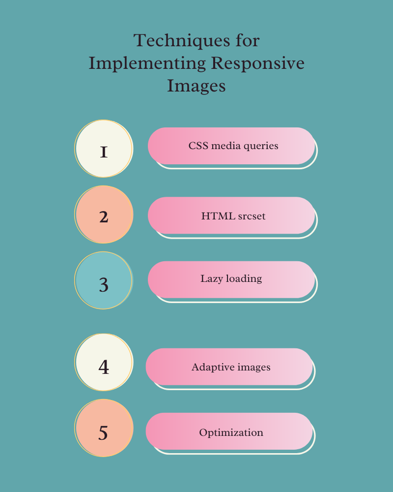
- CSS media queries – One of the most popular methods is using CSS media queries to adapt the image size based on the screen resolution. By specifying different image sizes for different breakpoints, you can optimize the images for various devices. This means that the images on your website will look sharp and clear, whether they are viewed on a large desktop monitor or a small smartphone screen.
- HTML srcset – Another technique involves using the HTML “srcset” attribute along with the “sizes” attribute. This allows you to provide multiple versions of an image and let the browser choose which one to display based on factors like screen resolution and viewport size.
- Lazy loading – Lazy loading is another useful technique that improves page load times by only loading images when they are needed. This not only helps reduce bandwidth usage but also enhances the overall user experience. With lazy loading, your website will only load images as the user scrolls down the page, which means faster load times and improved performance.
- Adaptive images – Adaptive images are also useful in delivering appropriately sized images based on device capabilities. With this technique, your website will automatically serve higher-resolution images to high-density screens while optimizing file sizes for smaller screens. This ensures that the user sees the best quality image possible without sacrificing loading times.
- Optimization – Compressing and optimizing your images plays a crucial role in ensuring fast loading times. Using tools like ImageOptim or TinyPNG can help reduce file sizes without sacrificing image quality. This means that your website will load faster, leading to improved user experience and better search engine rankings.
By employing these techniques, you can create a visually appealing and performant website that adapts effortlessly to various devices. Remember, responsive design isn’t just about making your site look good; it’s about providing an optimal browsing experience for all users,
Tools and Resources for Creating Responsive Images
Creating responsive images can be a complex task, but luckily there are numerous tools and resources available to help simplify the process. Here are some of the top options:
1. Picturefill: This JavaScript library allows you to easily implement responsive images by providing support for the HTML5 picture element and various polyfills.
2. Cloudinary: A cloud-based image management platform that offers automatic image resizing, optimization, and delivery capabilities, making it easy to create responsive images without sacrificing performance.
3. TinyPNG: This online tool is perfect for optimizing your images before uploading them to your website. It reduces file sizes while maintaining high quality.
4. Adobe Photoshop: The industry standard when it comes to image editing software, Photoshop provides powerful features for resizing, cropping, and optimizing images for web use.
5. ImageOptim: An open-source tool that helps reduce image file sizes without compromising on quality. It supports various formats such as JPEG, PNG, GIF, and SVG.
6. Google PageSpeed Insights: This free tool not only analyzes your website’s performance but also provides suggestions on how to optimize your images for better responsiveness.
7. Kraken.io: Another popular online image optimization service that offers lossless compression techniques to reduce file sizes without noticeable visual degradation.
With these tools at your disposal, you’ll have everything you need to create stunning and efficient responsive images for your website or web application
Best Practices for Optimizing Responsive Images
Here are a few best practices to keep in mind that will help enhance your site’s performance and user experience, while also ensuring that your images look great on all devices.
The first step in optimizing your images is to choose the right image format. Depending on the type of image you’re working with, JPEG, PNG, or SVG formats might be the best fit. JPEG is ideal for photographs and complex images with lots of colors, while PNG works well for simple graphics and transparent backgrounds. SVG, on the other hand, is perfect for scalable vector graphics.
Once you’ve chosen the appropriate image format, the next step is to optimize the size of your images without compromising quality. One way to do this is by using compression techniques to reduce file sizes without sacrificing resolution or sharpness. This can help decrease page load times and improve overall performance.
Leverage caching mechanisms to store static versions of your images so that subsequent requests can be served faster from a cache instead of being generated dynamically each time.
By following these best practices, you can effectively optimize your responsive images and improve the performance across devices
Conclusion
Responsive images are an essential part of web design and play a significant role in improving user engagement and SEO. By optimizing your images for various screen sizes and resolutions, you can enhance the browsing experience for your users while also boosting your search engine rankings.
Remember to stay up-to-date with the latest trends and techniques in responsive image technology to refine your skills and create stunning websites that adapt seamlessly across devices.


