Creating a landing page isn’t necessarily difficult, but ensuring that it converts is. A landing page should be specifically designed to convert visitors into leads or customers.
If you’re struggling to create a landing page that converts, you’ll find the information in this blog post helpful.
Table of Contents
What is a landing page?
In simple terms, a landing page is a one-page website focused on convincing users to take a particular action (usually signing up).
But most businesses struggle to create a successful landing page. It can be challenging because it requires specific and detailed knowledge about the audience and how they interact with your site.
In order to create an effective landing page, you need to understand user behavior, why they are visiting your site, and what specifically will drive them towards conversion.
The landing page, unlike other pages, usually has a funnel that drives people into it. It is not like a normal website that displays more about your services, your business, and your achievements.
The goal of any landing page is to make people take an action and convert them from mere visitors to clients and leads.
Attributes of a landing page
Creating a conversion-optimized landing page involves more than just slapping up a few images, and writing some witty copy. In order to convert visitors into customers, marketers must take into consideration the target audience and the product being sold.
This means finding the correct balance between image appeal with text, bullet points, and relevant information to increase trust and interest in the user. A successful landing page will not only drive conversions but also help build trust among your potential customers.
Here are some tips to get you started on creating an optimized landing page that converts visitors into customers. The main components that drive the conversion rate of any landing page are:
- Design of the landing page
- Value Proposition
- The Call to Action
- Social Proof
- The copywriting
- The product or service

I. Visual Design
It is very difficult to grab the attention span of a random stranger and make them hear what you are about to say. You might think that is an easy thing, but in reality, it is not.
Your website must be designed in such a way that it keeps the visitors focused on what you offer. Never put too much on their plates.
Never use too much of animations or visual effects. Sometimes people get too much into the visual design of the website and literally forget about what you offer them.
Keep your design minimal and at the same time use images and illustrations that can explain what you offer.
Don’t show them everything you have got and all your achievements. That might easily distract and confuse them. Be more precise and specific about one little thing and focus on it as much as possible.
II. Value proposition
The landing page must clearly state the value proposition.
That is the value that the users are going to get out of your business. A Value proposition must be attractive and interesting enough to make people want to read more about what you have got to offer and lead them to the next line or section of your landing page.
III. Call to action
Sometimes people might get convinced at the very beginning or they might not be patient enough to read the entire page.
That is why it is essential to have a strong call to action that clearly state to people what action should they take or where should they get directed after reading the value proposition. For Eg: sign up here.

If you use confusing words in your call to action, people will get confused too. They might not have an idea about what exactly they are supposed to do or where the click of that button will take them to. So they might end up not clicking it at all.
A call to action is not limited to just the start of the page. The call to action button should be placed all over the landing page and in the right places. About 3 to 4 call-to-action buttons always work the best.
IV. Have a social proof
People always need validation that what they actually see is real and legit.
Use testimonials, images of people using your service, and videos of people giving feedback about how your business has added value to their lives.
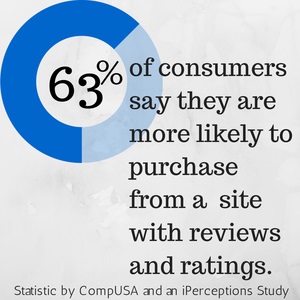
This motivates and creates interest in their mind to take quick action.
Structure of a Landing Page
Successful landing pages have a clear and compelling mission. They have a problem that needs to be solved, and they communicate that problem in a compelling way. The problem your landing page solves must be one that your target audience feels strongly about.
Before you design your landing page, you need to understand your target audience. Creating a persona for each user will allow you to have a better idea of their needs and problems. This can help you create a landing page that resonates with your visitors.
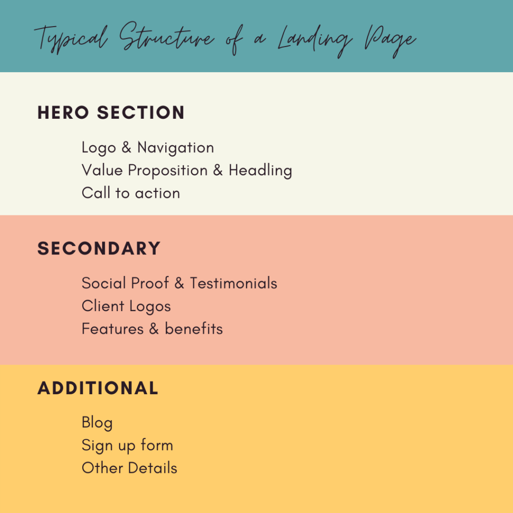
Here is a detailed analysis of the different sections that your landing page should have.
I. Hero Section
The hero section is the topmost section of a webpage. The very first area of the webpage that is visible to the user right after the webpage loads is the hero section.
It is essential to design a hero section with the right marketing tactics because with a rightly designed hero section you can create curiosity in the minds of users and make them read further content.
The hero section of the landing page should have the following elements.
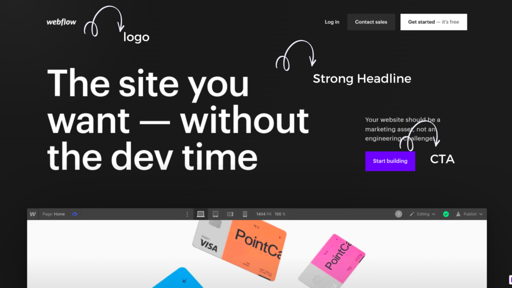
Logo & Navigation – Have an easy-to-use navigation bar that clearly mentions other pages of the website and a logo that speaks about your brand. A well-designed logo makes a business look professional and trustworthy.
Title/headline – A strong headline conveying the unique selling point or value proposition of your service or product. It should be short yet attractive, and simple, and should communicate to users about your service.
Call to action – Have a strong call to action element that tempts users to take an action right after reading the headline. The call to action should take the user to your service. It should have the right words that explain where it will take the user or what action the user is trying to perform by clicking it.
II. Secondary Section
The section after the hero section is a secondary section. It can include multiple other sections as well. Having the following elements in the second section provides a higher conversion rate to a landing page.
Social proof – A social proof or a testimonial creates trust in the user’s mind about a product or service. Give users a reason why they should choose your business over others and in what way it has helped other people.
Features & benefits – Explain more about the benefits your product/service can offer to a user. There is no point in expecting someone to invest their money in you when they are not convinced about the value that they will get back from the investment.
Even if it is a penny, people always need a value of some sort in return for their money. Describe the benefits, values, and unique features of your product and how it can help people.
More social proof & CTA- More social proof like case studies, and a list of popular brands you have worked or collaborated with will definitely be an add-on. Use another Call to action here.
III. Additional Section
It is evidently proven that very few people scroll down the page to read more. Every user’s attention span is short and people rarely spend time reading every line of your webpage. That is why you have a hero section that grabs the complete attention of any user and it deserves more consideration.
Only a handful of people read the secondary section and only a very few countable numbers read the additional section. Hence this section is less important. Have elements like Blog posts, FAQs, Founder’s notes, etc.., in this section.
Elements that increase landing page conversion
There are a lot of online tools that can help you create a landing page. Once you create your landing page, you can make any appropriate tweaks to optimize your landing page’s performance.
If you’re not confident in what you’ve designed, you can test and retest your landing page to find what works best.
Your landing page design is only one piece of the puzzle. Once you have a design you’re happy with, test and iterate on your landing page’s copy and conversion.
I. Understand the audience
A landing page persona is your main tool for understanding your target audience. You can create personas for your website visitors, email subscribers, and in-person customers.
Landing page personas are especially important for e-commerce sites. You can use them to understand the needs of your customers better, which can help you create more effective products and solve customer problems.
II. Find what works best for your site
If you’re designing your landing page based on your best guesses as to what will work, you might as well just put up a sign that reads “come on in!”. Most landing page failures can be attributed to being too confident of what will work.
You need to be confident about your product concept and know that your visitors will love it.
But you also need to be confident about what will work for your specific audience. If you’re too confident in what will work, you’re probably not testing enough and iterating quickly enough.
III. Use Interactive Elements
Quiz/Other Interactive elements – Use interactive elements like quizzes and surveys for lead capturing.
Exit Popup – It is proven that an exit popup makes the user perform an action and it works best for signup forms. When a user is about to leave and you show them a prominent thing then they are more likely to give their email before clicking that exit button.
Sticky header – Making the header sticky is a good conversion trick. You always have a call to action at the header and making a header sticky, makes it easier for users to click on the CTA button instead of wanting to search for it by scrolling the entire page.
Landing page examples
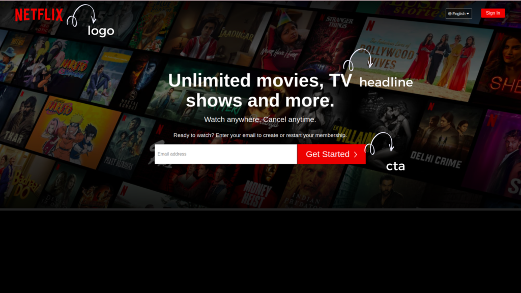
Here are two examples of landing pages a popular e-commerce platform and an entertainment platform.
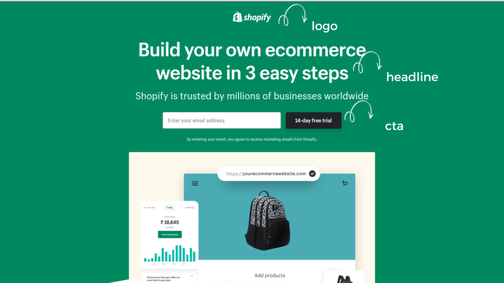
In these two examples, you could clearly see the structure of the hero section. These sites have a logo that takes about their brand, a simple, short yet strong headline, and a CTA that makes you take an action (Get started with the free trial by signing up with your email).
Bottom Line
It can be difficult to create a landing page that converts, but it can be done with a bit of effort. Landing pages can be tricky because they require a lot of user research and understanding of how to engage with your audience.
By understanding your users, their problems, and their pain points you can create a more effective landing page. Hope this article provided you with some insight into this topic.

