Introduction to UI Patterns
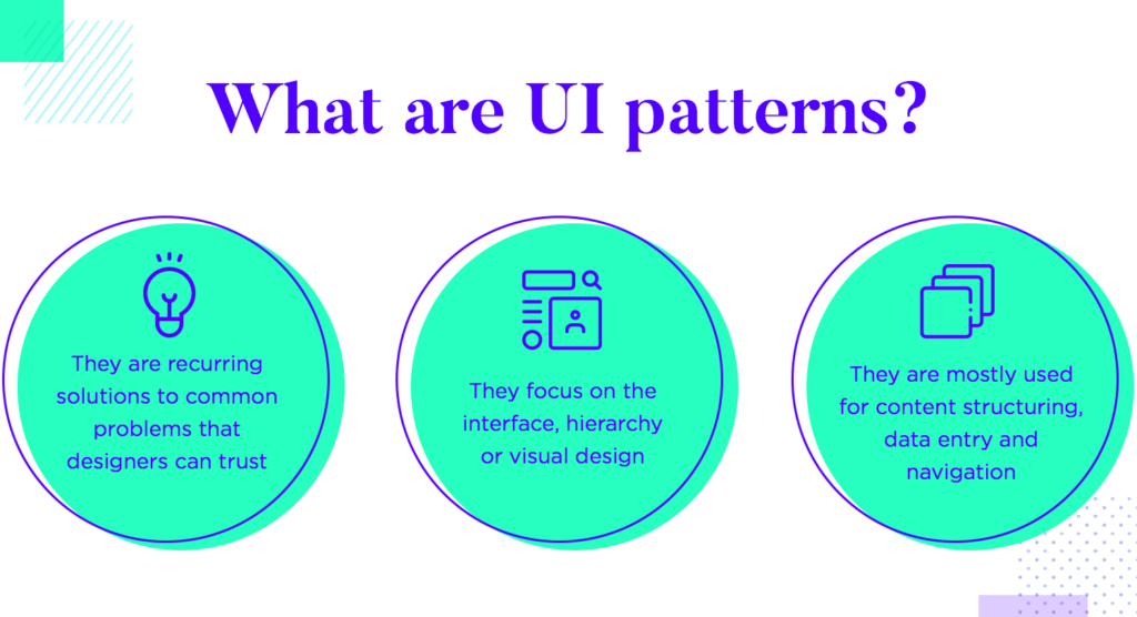
At the core of every great user interface are well-crafted layouts and elements. Whether you’re a professional designer or just starting out, understanding the importance of layout patterns and element designs is essential for creating visually appealing and functional interfaces. These fundamental building blocks impact usability, aesthetics, and overall user experience.
Why do layouts and elements hold such significance in user interface design? For starters, a well-designed layout can help users navigate through the interface seamlessly. It can guide them to the relevant information or action they are looking for. It can also help create a hierarchy of information, making it easier for users to prioritize what’s important.
Elements, on the other hand, can enhance the user experience by providing interactive and engaging features. For instance, buttons that change color or shape when clicked, or sliders that allow users to control their experience, can make the interface more enjoyable and intuitive.
In this post, let’s see some common UI patterns that designers use to create engaging interfaces.
Importance of Layouts and Elements in UI
One of the key elements of successful UI design is the layout. The layout determines how information is organized and presented on a webpage, making it easier for users to navigate and find what they are looking for.
A well-designed layout helps users quickly understand the structure of a page, enabling them to easily scan and locate important content. It also ensures consistency across different pages of a website, providing familiarity and reducing cognitive load.
In addition to layouts, UI designers need to pay attention to elements such as navigation menus, search bars, and call-to-action buttons. These elements serve specific purposes in guiding users through their journey on a website.
Navigation menus help users explore different sections or pages of a site effortlessly. A clear search bar allows users to quickly find specific information they are seeking. Well-placed call-to-action buttons prompt users to take desired actions like signing up for newsletters or making purchases.
By understanding the importance of layouts and elements in UI design, designers can create visually appealing interfaces that not only look good but also enhance usability and improve overall user experience.
Common Layout Patterns
There are several common layout patterns that designers can choose from, depending on the goals and requirements of their project.
A. Grid Layout
When it comes to designing a user interface, one of the most popular layout patterns is the grid layout. This type of layout organizes content into a series of columns and rows to create an attractive and structured appearance.
The grid layout allows you to align and position various UI elements such as images, text blocks, and buttons with ease. It creates consistency and balance throughout your design, whether you are designing a website or a mobile app.
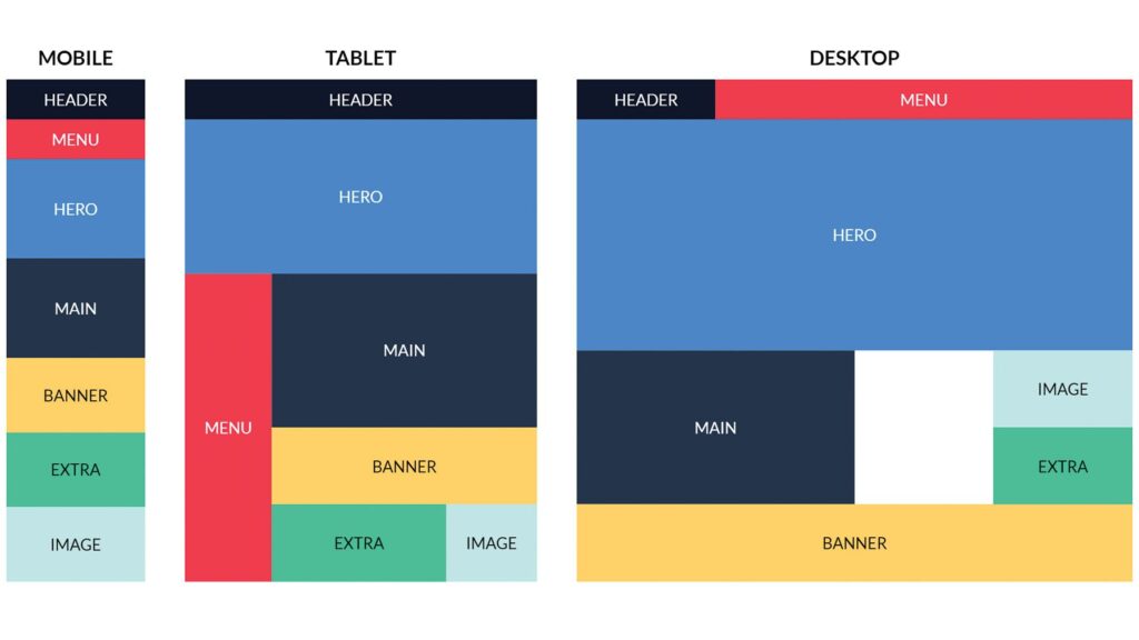
One of the most significant advantages of using the grid layout is that it ensures your design is responsive. The grid layout automatically adjusts the placement of elements based on the available space, making it easy to adapt to different screen sizes and device types.
Moreover, the grid layout improves readability by organizing content into well-defined sections within the grid cells. This way, users can quickly scan through information without feeling overwhelmed or confused.
B. Card-based Layout
The card-based layout consists of individual “cards” that hold specific pieces of content such as text, images, or multimedia. These cards can be easily rearranged or stacked together based on the user’s preference or device screen size.
One significant advantage of using this layout is its flexibility. It allows you to showcase various types of content in a structured way. Each card acts as an independent unit, making it easier for users to scan through the information quickly.
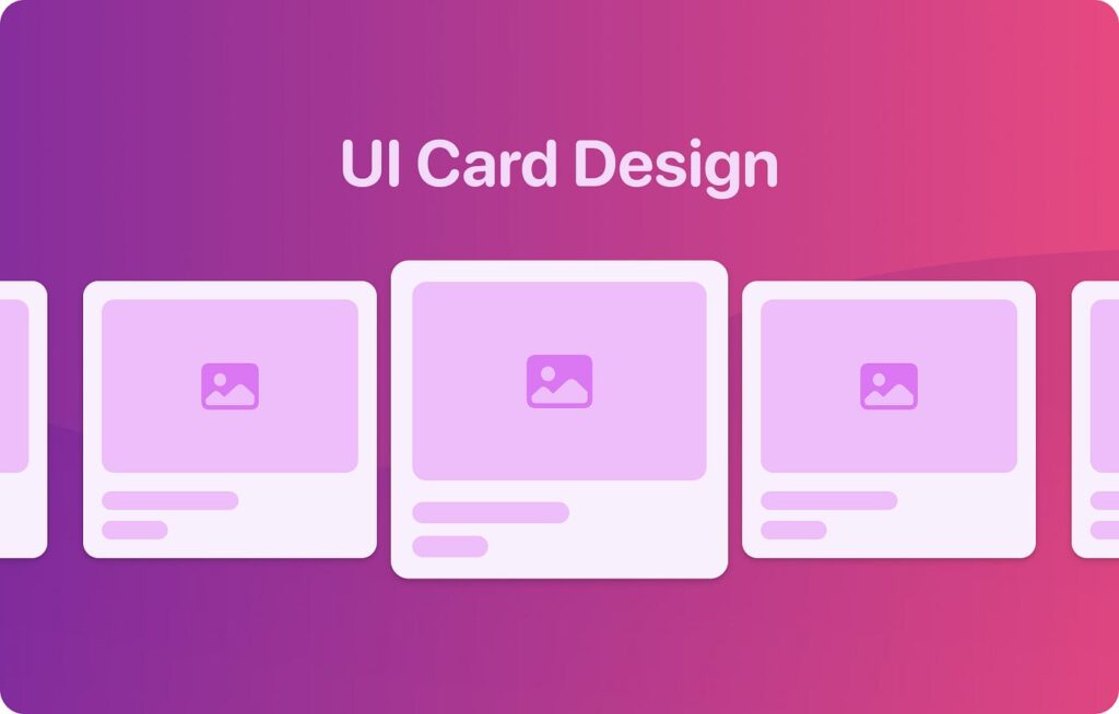
Moreover, the card-based layout also enhances the user experience by providing clear visual cues. The use of cards with distinct borders and shadows helps create a sense of hierarchy and orderliness within the interface.
Another benefit is that this layout pattern is highly responsive. It adapts well to different screen sizes without losing its usability. This makes it an ideal choice for mobile devices where space is limited.
Furthermore, by employing interactive elements like buttons or links within each card, users can easily navigate between different sections or perform desired actions without feeling overwhelmed by too much information at once.
C. Single Page Layout
This layout has all content displayed on a single page, so users need not navigate through multiple pages.
With all the information presented in one place, users can easily scroll or swipe through the content without any interruptions or loading times. This makes it ideal for websites that aim to showcase products or services/
Another benefit of the single page layout is its simplicity and clarity. By condensing everything onto one page, you can have more control over how information is presented and organized. This allows for a cleaner and more focused design that can be easily understood by users.
Moreover, the single page layout is ideal for mobile responsiveness. The single page layout naturally adapts to different screen sizes and resolutions, ensuring a consistent user experience across devices.
Common Element Patterns
These are some of the common UI Element Patterns used in web designs:
A. Navigation Menu
Navigation menus are a crucial element in user interface design. They provide users with a clear and organized way to navigate through different sections of a website or application. A well-designed navigation menu can greatly enhance the user experience by making it easy for users to find what they are looking for.
There are several common types of navigation menus that designers can choose from, depending on the specific needs of their project. The most traditional type is the horizontal menu, which is typically placed at the top of a webpage and includes links to different pages or sections. This type of menu works best for websites with multiple pages or categories.
Another popular option is the vertical menu, which is often found on the left side of a webpage. This type of menu works well for websites that have a lot of content or hierarchical structures, as it allows users to easily navigate through different levels.
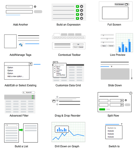
In recent years, there has been an increasing trend towards using hamburger menus, especially in mobile designs. The hamburger icon consists of three horizontally stacked lines and when clicked or tapped, it opens up a hidden navigation drawer where all the menu options are displayed.
Choosing the right navigation menu pattern depends on several factors such as screen size, content structure, and overall design goals. It’s essential to consider usability and accessibility when selecting a navigation pattern to ensure that users can easily find what they need without frustration.
B. Search Bar
The search bar allows users to easily find what they’re looking for on a website, app, or software platform. It provides a quick and efficient way for users to navigate through vast amounts of information.
The placement and design of the search bar can greatly impact user experience. It should be prominently displayed in the header or navigation menu so that it’s easily accessible. A magnifying glass icon is commonly used to indicate its purpose, making it instantly recognizable.
In terms of functionality, the search bar should have an auto-suggestions feature that provides users with relevant results as they type. This helps them refine their search and find what they’re looking for faster. Additionally, incorporating filters or categories within the search results page can further enhance usability by allowing users to narrow down their search based on specific criteria.
When designing a search bar, simplicity is key. Keep it clean and uncluttered with enough space around it for ease of use on both desktop and mobile devices. The text input field should be large enough for comfortable typing but not overwhelming in size.
C. Call-to-Action Buttons
Call-to-action buttons play a significant role in guiding users towards desired actions and conversions on a website or app. These buttons are strategically placed to catch the user’s attention and encourage them to take the next step.
The design of call-to-action buttons should be visually appealing, well-positioned, and easily noticeable within the layout. The color, size, shape, and text on these buttons all contribute to their effectiveness. A contrasting color can make the button stand out while clear and concise text ensures clarity of purpose.
It is crucial to consider the context when designing call-to-action buttons. For instance, an e-commerce site might use “Add to Cart” or “Buy Now” as the text for its product pages’ call-to-action buttons. On the other hand, a newsletter signup form could use “Subscribe” or “Join Our Mailing List.”
To enhance usability and accessibility, designers often add hover effects or subtle animations to call-to-action buttons. This provides visual feedback when users interact with them.
How to Choose the Right UI Pattern for Your Project
The UI pattern you choose will determine how users interact with your website or application. With so many options available, how do you know which one to choose? Here are some factors to consider when making this decision.
Consider the purpose of your design. What are you trying to achieve? Is it a simple informational website or a complex e-commerce platform? Understanding the goals and objectives of your project will help guide you in selecting the most appropriate UI pattern.
Consider your target audience. Who are they and what are their needs and preferences? Conducting user research can provide valuable insights into their behavior and expectations. This information can then be used to inform your choice of UI pattern.
Scalability. Will your project expand in the future? If so, it’s essential to choose a UI pattern that can accommodate growth without compromising usability or visual appeal.
Take into account industry best practices and trends. Keeping up with current design standards ensures that your interface remains modern and relevant.
Don’t be afraid to experiment and iterate. User feedback is invaluable when refining your chosen UI pattern. Continuously test different elements and layouts until you find what works best for both you as a designer and for your users.
Case Studies: Real-life Examples of Successful UI Patterns
Having explored the common layouts and elements used in user interface design, let’s take a look at some real-life examples of successful UI patterns. These case studies will provide insights into how different companies have implemented effective UI patterns to enhance their users’ experience.
1. Airbnb – Card-based Layout
Airbnb utilizes a card-based layout on its search results page, where each listing is presented as an individual card. This design allows users to quickly scan through multiple options and make informed decisions based on key information displayed on each card. The intuitive design helps users easily filter and sort listings according to their preferences.
2. Spotify – Grid Layout
Spotify employs a grid layout for its “Discover Weekly” playlist feature, showcasing personalized music recommendations in a visually appealing way. The grid format allows users to scroll horizontally through album covers, making it easy to browse and explore new songs or artists effortlessly.
3. Apple – Single Page Layout
Apple uses a single-page layout for many of its product pages, providing all relevant information within one scrolling experience. By consolidating content onto a single page, Apple ensures that users can access everything they need without having to navigate through multiple tabs or sections.
It is important to note that while these examples have been successful for these particular companies, every project has unique requirements and considerations.


