From calming blues to vibrant reds, the right choice of colors can evoke right emotions, convey brand personality, and enhance usability.
In this guide, we’ll delve into the enchanting realm of color theory and provide you with practical tips on selecting the right colors that will make your website shine.
The Importance of UI Colors in Design
Colors have the incredible ability to evoke emotions, create visual hierarchy, and establish brand identity. When used strategically, they can guide users through an interface, highlight key elements, and even influence their decision-making process.
Imagine visiting a website with a chaotic mix and match of colors. It would undoubtedly create confusion and make it difficult for users to grasp the intended message. On the other hand, a well-thought-out color scheme can instantly capture attention and engage users from the moment they land on your page.
Colors do play a crucial role in branding. They help convey your company’s personality and values while creating recognition among your target audience. Think about how iconic brands like Coca-Cola or Facebook are instantly recognizable by their signature red and blue hues.
Furthermore, color psychology comes into play when selecting UI colors. Different colors produce specific emotional responses for example blues are calming, and yellows are energizing.
Understanding Color Theory
Color theory is an essential part of creating visually pleasing designs. It involves understanding how colors work with each other and what emotions they evoke. By learning the principles of color theory, you can choose color schemes that improve your UI design.
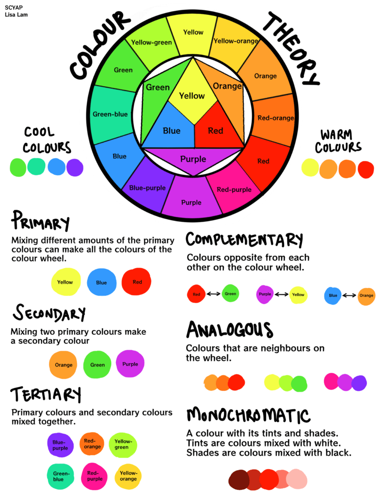
One critical aspect of color theory is the color wheel. The color wheel displays all possible hues in a circular format. The primary colors – red, blue, and yellow are evenly spaced around the wheel and form the foundation for creating other colors.

Complementary colors are colors that are opposite each other on the color wheel. When these colors are used together, they create high contrast, making elements stand out. In contrast, analogous colors are colors that are next to each other on the wheel. These colors create harmony and cohesion in a design.
Another important concept in color theory is saturation or intensity. Saturation refers to how pure or vibrant a color appears. High saturation creates boldness and energy, while low saturation creates more muted tones.
Understanding warm and cool colors can significantly impact your design choices. Warm colors such as reds, oranges, and yellows evoke feelings of energy and excitement. In contrast, cool colors such as blues and greens convey calmness and serenity.
Types of Color Schemes
Choosing the right colors for your UI design is crucial, and understanding the different types of color schemes can make all the difference. Here are some popular types of color schemes you can consider:

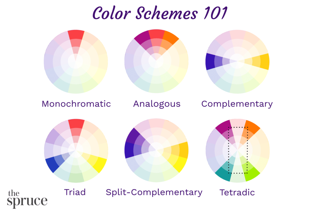
- Monochromatic: This type of color scheme uses different shades and tints of a single hue. It creates a clean and minimalist look while maintaining consistency. Monochromatic schemes are perfect for those who want a simple yet sophisticated design.
- Analogous: An analogous color scheme consists of colors that are adjacent to each other on the color wheel. This creates a cohesive and harmonious effect, making it easy on the eyes. Analogous schemes are perfect for those who want a peaceful and calming design.
- Complementary: Complementary colors are opposite each other on the color wheel, creating a high contrast effect when used together. This type of scheme adds vibrancy and excitement to your UI design. Complementary schemes are perfect for those who want a bold and energetic design.
- Triadic: A triadic color scheme involves selecting three equally spaced colors from the color wheel, resulting in a balanced and visually appealing composition. This type of scheme allows for a lot of variety and creativity while maintaining balance.
- Split Complementary: Split complementary is similar to complementary with more variety. It consists of one main color, plus two colors adjacent to its complement. This type of scheme adds depth and richness to your design while maintaining balance.
With these different types of color schemes in mind, you can experiment and find what works best for your UI design project.
Tips for Choosing the Right Colors for Your UI
Choosing the right colors for your UI design can be a daunting task, but these tips can help guide you in the process:
- Brand’s identity and message: The colors you choose should align with your brand’s values and personality. For example, if your brand is all about energy and excitement, bold and vibrant colors would be a good choice.
- Emotions you want to evoke: Different colors have different psychological effects on people. Warm tones like reds and oranges can create a sense of urgency or passion, while cool tones like blues and greens can promote calmness or trust.
- Accessibility: Ensure there is enough contrast between text and background colors for easy readability. Consider using online tools that simulate various types of color blindness to ensure that all users will be able to perceive the information displayed on your UI.
- Experiment with different color combinations: Play around with different hues, shades, and tints within a chosen color palette until you find the combination that works best for your UI design.
- User testing: Show prototypes of your UI designs featuring different color schemes to potential users and gather feedback on their preferences and perceptions.
Every brand is unique, so choose colors that align with your branding guidelines and target audience preferences.
Common Mistakes to Avoid in Color Selection
There are some common mistakes that designers often make when selecting colors. Here are some pitfalls to avoid:

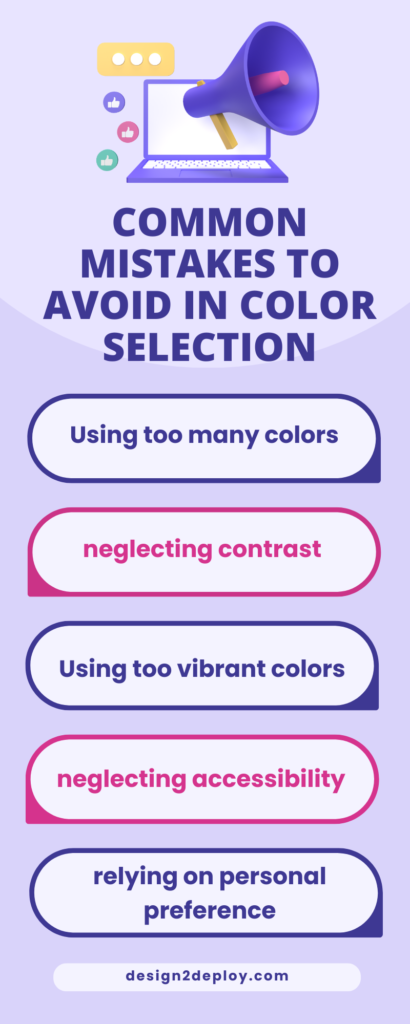
- Using too many colors: Incorporating a wide range of hues can result in a cluttered and confusing interface. Instead, opt for a limited color palette that includes no more than three or four main colors.
- Neglecting contrast: Poor contrast between text and background can make it difficult for users to read content. Ensure that there is sufficient contrast so that text stands out clearly against the background.
- Using overly vibrant or saturated colors: These types of colors may grab attention initially but can quickly become overwhelming and tiresome for users over time. It’s essential to strike a balance by incorporating both bold and subdued tones in your color scheme.
- Neglecting accessibility: Some individuals may have visual impairments or color blindness, so it’s essential to select colors that are easily distinguishable by all users.
- Relying solely on personal preferences: While you may have certain favorite shades or combinations, always consider how they align with your branding goals and target audience preferences.
By avoiding these common mistakes in color selection, you’ll be able to create an amazing UI design that enhances usability and effectively communicates your brand message.
Conclusion
Choosing the right colors for your UI design is crucial to creating an engaging and impactful user experience. By understanding color theory, exploring different color schemes, considering color psychology, and avoiding common mistakes in color selection, you can create a visually attractive UI. It is also important to align your color palette with your brand identity.


