What is Hotjar?

Hotjar is a feedback and behavior-tracking software that helps you understand more about your audience and create a better user experience. It is basically an analytics software that helps you understand the behavior of your users and how it can impact your business. Hotjar vs Google Analytics Hotjar is not a replacement or alternative to google analytics. It has to be used along with it for more detailed insight and analytics. Google Analytics provides data about the pages the users have visited, the demographical information about the users, overall website traffic to the site and individual pages, and the conversion and bounce rate.  However, hotjar is more about analyzing the behavior of the users visiting the page. It helps you understand how users are actually interacting with the website and on various devices like desktops, tablets, and mobiles. If google analytics point out that the home page has a higher bounce rate, hotjar will specifically point you to the reasons why people are bouncing out and what made them do it so that you can work on making the necessary changes to decrease the bounce rate.  Features Hotjar revolves around two basic features, observe and ask. The observing feature lets you observe the behavior of the users and how they react to your website, whereas the feedback feature lets you ask them questions and feedback on their experience and improvements to be made I. Observe Feature There are two tools in this feature. Heatmaps and Session recordings. These are the behavioral tools. These tools analyze the behavior of the user/visitor that uses your website. Heatmaps  Helps you find out what people really think of your website and how they are interacting with it. You get to visually see where people are clicking within a website, how far they are scrolling inside a webpage, and in which part of the page the users are spending most of their time on. With this data, you can easily identify the user’s pain points when they are using your service. Session recording  This tool gives you the ability to literally look at the recording of the visitor’s screen when they are using your website. You get a video of how people are interacting with your website, whether is it really what you expected them to do, and analyze how they respond to different sections of the website and different pages within the website. Are the users facing any difficulties when doing tasks like filling out a form, or finding the call to action button, is the website easy to understand and navigate? What visitors are focussing on and what they are ignoring. All this information can be analyzed from the session recording of the users. It helps the website owners identify the usability and accessibility issues within their website, that when corrected can not only help owners redesign their website based on the data but also witness an increase in overall user engagement and conversion.  II. Feedback Feature The following two tools are the feedback tools that help in getting user feedback. Incoming Feedback A way to collect anonymous data or feedback from the visitors on the overall experience of the website and what else can be improved on it. It also acts as an indirect lead capture when people enter their email when providing the feedback. Surveys You can also collect feedback for your website by creating simple or complex surveys. Surveys are used to gather the customer’s response on the overall look and feel of using your website and how satisfied are they with your service, product, or website’s usability. Why use Hotjar? These are four main and notable features of hotjar. Trusted by Many – Many big and popular companies use hotjar for their businesses. It is also GDPR and CCPA compliant. If you run your business from a country that wants your website to abide by this law, then hotjar covers that too. They provide a 15-day free trial. Reduce assumptions and increase confidence – After analyzing the website using hotjar, you can A/B test your website with different changes and can easily drop or reduce the bounce rate of the website by a significant percentage. Discover issues and prioritize fixes – Increase the overall conversion rate, get issues and fix them as soon as possible. Easy to Integrate – You can easily integrate hotjar with multiple other platforms like Slack, Zapier, Optimizely, Segment, Hubspot, Google optimize, etc.., Hotjar integration is not just limited to this, you can also integrate hotjar using Zapier to multiple other popular platforms like Convertkit, google analytics, Freshdesk, and MailChimp to name a few. It also provides easy-to-install plugins for certain popular platforms like google tag manager, WordPress, dozens more, Shopify, and click funnels. How can hotjar help in improving your website? It is much more than your basic google analytics. Hotjar makes your website a better experience for your users. After signing up, hotjar provides you with a tracking code for your website that you can embed in your website to track more details about the users. Here is a list of points on how hotjar help in improving your website: Hotjar Pricing Hotjar offers 3 types of packages, the observe package, the ask package, and the custom package. And within each package, there are 4 different plans. If you need access to both the observation features and feedback features you need to opt for both plans individually. Opting to only any of these packages provides you access to only those features. Signing up for observe package doesn’t provide access to the ask package. The observe package The observe package includes the observable features namely the heatmaps and session recording. There are 4 plans within the observe package namely the basic plan, plus plan, business plan, and scale plan. Basic plan – free plan, and it includes access to 1050 recorded user video sessions per month, unlimited heatmaps  Plus plan – $32 / month plan that includes access to 3000 recorded video sessions, ability

What is Hotjar? Read More »

A/B Testing Common Mistakes to Avoid

A/B testing is a powerful tool for optimizing your website’s performance and improving user experience. By experimenting with different variations of your website or landing page, you can gather valuable insights about what resonates best with your audience. However, as with any scientific experiment, there are certain mistakes to avoid to ensure accurate results. In this blog post, we’ll explore the common pitfalls of A/B testing and provide tips for success. What is A/B testing and why is it important? A/B testing, also known as split testing, is a method used to compare two versions of a webpage or app screen to determine which one performs better. It involves randomly dividing your audience into two groups and showing each group a different version of your design. By analyzing user behavior and engagement metrics, you can identify which variation drives higher conversions. But why is A/B testing so important? Because, making decisions based on assumptions or gut feelings simply won’t workout. A/B testing allows you to make informed decisions backed by concrete evidence. It enables you to understand how changes to your website impact user experience and ultimately drive results Moreover, A/B testing helps eliminate guesswork from the equation. Instead of relying solely on subjective opinions or industry trends, you can rely on real-world experiments that provide tangible insights into what works best for your specific audience. Optimizing your website through A/B tests can lead to significant improvements in key performance indicators such as conversion rates, click-through rates, bounce rates, and even revenue generation. By continually refining and honing your digital properties based on data-driven insights gained from A/B tests, you can create an optimized user experience that resonates with your target audience. Dos of A/B testing: To ensure successful A/B testing, it’s important to follow some key dos. Here are a few dos of A/B testing: A. Set clear goals and metrics To ensure successful A/B tests, it is crucial to set clear goals and metrics from the start. Before starting any A/B test, it’s crucial to clearly define what you want to achieve and the metrics you’ll use to measure success. Whether it’s increasing click-through rates, improving conversion rates, or boosting revenue, having specific goals in mind will help guide your testing process. Next, determine which metrics are most relevant to track for your goals. For example, if you want to increase conversions on a product page, tracking metrics such as add-to-cart rate or checkout completion rate would be appropriate. By selecting the right metrics, you can gain valuable insights into user behavior and make informed decisions. Remember that setting clear goals and metrics is essential not only for measuring success but also for guiding the entire A/B testing process. It helps prioritize which elements to test and provides direction when analyzing results. B. Test one element at a time  While it may be tempting to make multiple changes in an A/B test, doing so can lead to skewed results and confusion about which change actually had an impact. Instead, focus on changing one element at a time, such as headlines or call-to-action buttons, so you can accurately attribute any improvements or declines to the specific change you made. By testing one element at a time, you can accurately measure the impact of that specific change on your website or marketing campaign. If you make multiple changes simultaneously, it becomes difficult to determine which change actually led to the observed results. For example, let’s say you want to improve the click-through rate (CTR) of your email newsletter. Instead of changing both the subject line and call-to-action button color at once, test them separately. This way, you can identify whether the subject line or button color has a greater impact on CTR. Testing one element at a time also allows for more accurate analysis and interpretation of data. It provides clear insights into what works and what doesn’t in terms of user behavior and preferences. Moreover, testing one element at a time makes it easier to apply the insights gained from your A/B tests to future optimization efforts. If you test multiple elements at once, it can be difficult to isolate which change had the desired impact and apply those learnings to future tests. So remember, when conducting A/B tests, resist the temptation to make multiple changes all at once. Take it step by step by focusing on testing one element at a time for optimal results. C. Ensure a large enough sample size One common mistake that many businesses make when conducting A/B testing is not ensuring a large enough sample size. This can lead to inaccurate results and unreliable conclusions. To get reliable data, it’s important to have a sufficient number of participants included in your test. A small sample size may not accurately represent the larger population, leading to skewed results that don’t reflect the true impact of your changes. By ensuring a large enough sample size, you increase the statistical power of your test and reduce the chances of drawing incorrect conclusions. It allows for more accurate analysis and helps identify meaningful patterns or trends in user behavior. So how do you determine what constitutes an adequate sample size? Well, it depends on various factors such as the desired level of significance, expected effect sizes, and variability within your target audience. Consulting with statisticians or using online calculators can help you determine the appropriate sample size for your specific case. Ensuring a large enough sample size is crucial for obtaining reliable results from A/B testing. Don’t underestimate its importance – take the time to gather sufficient data before drawing any conclusions or making significant changes based on your tests’ outcomes. Don’ts of A/B testing: Here are some of the common don’ts of a/b testing: A. Testing too many variables at once One of the biggest mistakes that people make when conducting A/B tests is testing too many variables at once. While it may seem like a good idea to test multiple elements simultaneously, this approach

A/B Testing Common Mistakes to Avoid Read More »

The Role of Prototyping in UX

Prototyping is a powerful tool that brings UX concepts to life, allowing designers to visualize their app or website before it even hits development. With prototyping, designers can transform abstract ideas into actual designs, test them, gather feedback, and iterate until perfection.  In this blog post, we’ll explore the role of prototyping in UX design, discuss different types of prototypes and highlight some useful tools that simplify the prototyping process. Benefits of Prototyping in the Design Process Prototyping is an essential part of the design process that offers several benefits to UX designers. One of the most significant advantages of prototyping is that it brings ideas to reality by allowing the designers and developers to experience and visualize a product before it’s fully developed. This early feedback helps identify potential issues and make necessary adjustments, saving both time and resources. Another significant benefit of prototyping is its ability to enhance collaboration among team members. By creating interactive prototypes, designers can effectively communicate their vision to developers, ensuring everyone is on the same page. This collaborative approach fosters better understanding, reduces misunderstandings, and ultimately leads to more efficient development. Moreover, prototyping allows designers to test the user experience (UX) throughout the design process. By presenting users with interactive prototypes, designers can gather valuable insights about user behaviour and preferences. These insights help refine the UX by addressing pain points or making improvements based on real-user feedback. Prototyping also enables designers to experiment and iterate. Since prototypes are quick and easy to modify compared to fully developed products, designers can explore different design solutions without significant financial or time investments. This flexibility encourages creativity while minimizing risks associated with implementing untested features or designs. It also serves as a powerful tool for validating assumptions made during earlier stages of the design process. It provides evidence that a particular concept or idea works well in practice before committing extensive resources towards implementation. Types of Prototypes There are various types of prototypes that UX designers can use to bring their ideas to life. Each type serves a different purpose and offers unique benefits throughout the design process. It’s essential to understand each type of prototype to choose wisely based on project goals at different stages of development. The right choice facilitates effective collaboration among team members ensuring valuable insights from users during testing phases. Tools for Creating Prototypes Creating successful prototypes for UX design requires access to the right tools. With so many options available, selecting the best tool to meet your needs can be difficult. That is why we have listed the best ones: While these are just a few examples of the many tools available today, each one has its own unique strengths and features that cater to different designer preferences or project requirements. Ultimately, finding the right tool depends on your specific needs as well as personal preference. Tips for Effective Prototyping To ensure that your prototypes are effective, here are some tips to keep in mind: By keeping these tips in mind, you can create effective prototypes that accurately represent your design ideas and provide valuable feedback from users and developers.

The Role of Prototyping in UX Read More »

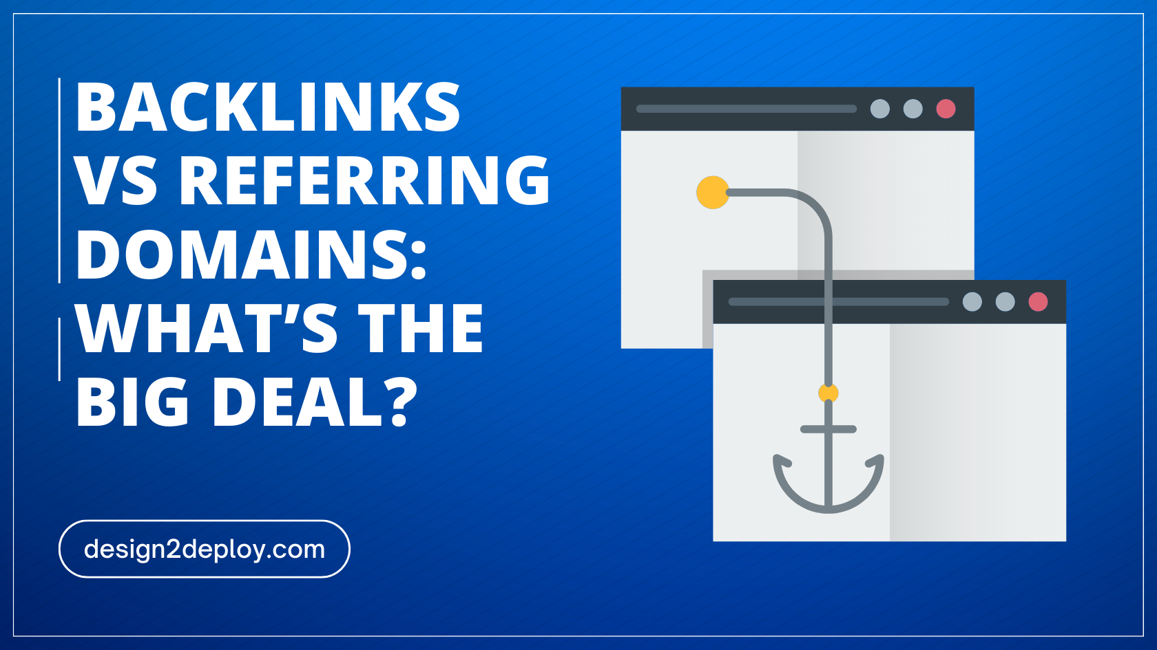
Backlinks Vs Referring Domains: What’s the Big Deal?

Are you familiar with the terms “backlinks” and “referring domains”? If you’re in the world of search engine optimization, then these phrases are likely part of your daily vocabulary. But for those who are new to SEO, understanding the difference between backlinks and referring domains can be confusing. In this blog post, we’ll break down backlinks vs referring domains, and their importance for website ranking, and provide tips on how to improve both metrics. So read on to learn more about backlinks vs referring domains! What are Backlinks? Backlinks are links that point to your website from other websites. For example, Let’s say you have an article about “Top 10 ways to reduce belly fat”. And websites related to the fitness niche let’s name them ‘Site A’ and ‘Site B’ for now find your article and find it interesting. So, eventually, these sites will mention your article when they write about content related to reducing bellying fat. A portion of a text will be chosen to link to your article on “Top 10 ways…”. The chosen text is known as the anchor text. And this process of linking to other people’s content/posts is known as backlinking. FUN TASK: Mention the number of external links that we have used on this post in the comments! What are Referring Domains? So, now that you know what backlinking is, understanding referring domains is so simple. The website from which the links are coming is called the referring domain. In the example we discussed, the sites ‘Site A’ and the ‘Site B’ are the referring domains. The main difference between backlinks and referring domains is that backlinks are an indication of the number of links pointing to your website while referring domains show the number of unique websites linking to you. Backlinks and SEO If you are trying to learn about SEO, blogging, or marketing you definitely must have come across the phrase backlink without a doubt. Is that a big deal? Why do people fuss so much about backlinks? Blogging has bloomed like never before in recent years, and with that, a lot of people started creating blogs, and the competition is heavy. For every search query, google shoots you millions of search results. But only a handful gets a lot of traffic and eyeballs. How does that happen? Multiple factors can contribute to this. But, the most important among them is the number of backlinks a post has. If a post has a huge number of backlinks, it is ultimately a signal to Google that the website is an authority and is definitely trustworthy (since many other websites do believe so). So, Google will eventually rank these articles with higher backlinks in the search results. More Number of Eyeballs == More Revenue That is why people are so crazy about backlinks and there are several link-building companies that will help you with this process of building relevant backlinks in your niche. How to get backlinks and referring domains There are a number of ways to get backlinks and referring domains. The most common way is through link building. Link building is an extensive topic on its own. But in simple terms, it involves using various approaches to get more backlinks to your site or post. Some of which include submitting articles to directories, guest blogging, or by participating in forums and discussion boards like Quora or Facebook groups. You can also get backlinks and referring domains by creating great content that other websites will want to link to. Finally, you can use social media sites like Twitter and LinkedIn to generate backlinks and referring domains. Factors of the best backlink profile Yes, your articles need backlinks. But not all backlinks are equally good or valuable. There are various factors that Google will take into account when considering your backlink profile. i) Diversification Diverge your backlink profile to include links from multiple referring domains. If a post or page gets a backlink, make sure to get 10 backlinks from different referring domains instead of getting all those 10 links from a single referring domain. Getting links from various websites increases your website’s authority and ultimately helps with your SEO. ii) Domain Authority The domain authority of the referring domain does play a major role. Getting a backlink from a referring domain with a domain authority of 50 is a lot more valuable than getting one from a website with a domain authority of 10 or 20. But it doesn’t mean you should avoid backlinks from domains with low DA value. These domains also help and over a period of time when these referring domains with lower DA values started picking up & getting more traffic, it will automatically be beneficial to your site as well. iii) Site Quality Most of the time, especially when people buy backlinks it is easier to get fooled. When you get a backlink from a site it has to be a well-maintained site with no history of scams or other attacks. Even if the DA is low if a site is well-maintained backlinks do provide value. But, getting backlinks from spammy, fishy sites including gambling, drugs, and other illegal activities can affect your site’s ranking as well. iv) Relevancy The backlinks have to be relevant enough. Linking to a weight loss post in a technology blog doesn’t feel right, isn’t it? The backlinks you get or you give has to be relevant to the topic and content in the post. This will add a lot of value to both parties. Conclusion In summary, understanding the differences between backlinks and referring domains is essential in devising an effective link-building strategy. With this knowledge, you can start today building a powerful link profile that will help increase your search engine rankings and traffic from organic searches.

Backlinks Vs Referring Domains: What’s the Big Deal? Read More »

Godaddy Website Builder Review

Building a website has become easier than ever before. With different types of website builders in the market, it is becoming easier to build websites. WordPress is the forefather of CMS-based website builders. Almost a decade ago, wordpress was the leading CMS platform dominating the website building market. Even now, over 40% of the websites in the world are made of wordpress CMS. But without competition, there can never be an improvement. New website builders started to emerge with the hope of beating wordpress out of its place. One such builder is the GoDaddy Website builder. GoDaddy started as a popular Domain Registrar and web hosting company selling quality domain names and hosting at the cheapest and most affordable rates. In 2017, GoDaddy launched its website builder. Let’s see an in-depth review of the GoDaddy website builder, its pros and cons, and if it is the right fit for your business. GoDaddy’s website builder mainly targeted small businesses. The Interface was made as easy and simple as possible to use and understand. It started off with a limited set of features but was easy for anyone to use and build websites. And with time, the builder has gradually evolved into a better product making it suitable for small businesses, people starting out businesses with a limited budget, and for personal portfolios. You can create websites in a few minutes if you already have got some experience working with drag-and-drop website builders. If you are looking for a website builder with a decent set of customization options and basic features, then GoDaddy might satisfy your requirements. The interface is easy to use, and pretty simple to understand even without any guide or how-to tutorials. Godaddy provides you access to email marketing tools and social media posting tools even in the basic version of the website builder. There are not a lot of design and customization options that the builder has. There are very minimal changes you can do to your designs. This might be suitable if you are setting up a portfolio website or a simple one-page website. If your design requirements are higher, then GoDaddy is not your tool. Also, it is not the best choice for setting up an e-commerce store, blog, or other complex website types. Pricing Godaddy offers 4 paid plans and a free plan. With each plan, you get to access some advanced features. Basic Plan The basic package is the cheapest of all and it comes at $9.99 a month. Features SSL Certificate – Free SSL Certificate which is absolutely essential for any website. Custom Domain – Use of custom domain, you can use any domain of your choice. You are not restricted to using the GoDaddy domain name, the one that comes in the free version. Customer Support – You get access to amazing Customer Support. Custom guidance from the technical support team if you ever got stuck in the process of building your website or if you have doubts or queries in the process. Free Business Email – A Free Business Email that matches your brand Insights – You will get a dashboard where you can see all the insights about how your site performs, the visitors, and the clicks it gets Online appointments – If you choose to build an appointment booking site, then the basic plan gets it covered. Standard This comes at $14.99 a month. It includes all the features that are available in the basic package. Along with those features, it also gives you access to SEO tools, Expanded email, and social media marketing. If you are a small business owner, this plan is an absolute value for the money. With all the marketing efforts built right within the platform, this package is completely worth its price. Premium It is a $ 19.99-a-month package. This includes all the features of both basic as well as standard packages. It has a lot more advanced customization options for the appointment booking feature. Though the appointment booking feature is available in all the paid plans, this plan gives you more control over it. It includes features like recurring appointment bookings, One-time group events setup, Payments for appointments, and Email and text appointment reminders. The Limit on the Social Media and Email Marketing that comes with the standard package is removed. You get access to Unlimited Socia Media Platforms and Social Posts & Responses per month. Ecommerce It comes at $24.99. Along with all the features available in the other plans this plan also includes eCommerce functionality. You can set up your online store, and list your products. Payment System – Has flexible payment systems. All the popular payment systems available in the market are supported, including Stripe and PayPal. If you already have your website set up in GoDaddy and are looking to set up or scale your existing one to an online store then this would be a great option. But if you are starting out, then choosing Shopify for your e-commerce store is a lot better than Godaddy. For e-commerce, the features aren’t that extensive especially when it comes to designing the product page, and listings page. Free Package Godaddy offers an Unlimited Free Trial which means your website with the free package never expires after a specific time frame. But you are limited to the available features. You can’t use your custom domain names, suitable for temporary resumes or portfolios while applying for jobs or other freelancing work. Your brand can’t stand uniquely. The site will have GoDaddy branding on it. Pros & Cons Website Templates – Need not always start designing your website from scratch. GoDaddy comes with a set of pre-made templates for different categories that you can make use of with a click of a button. Flexibility and Expandability – GoDaddy is great for beginners, small businesses, static websites, portfolios, and other less resource-intensive websites. It isn’t a great option if you want to scale your website in the future. SEO Optimization – When compared

Godaddy Website Builder Review Read More »

What Is Link Cloaking, Why It Matters, and Plugins You Need

If you are one of those affiliate marketers or a blogger. You probably would have used affiliate links in your websites, blog posts, or campaigns. And you should have also heard about the term link cloaking a lot. But if you are not quite sure about the term, in this article you will learn in detail about what link cloaking is, the benefits of link cloaking, and the best free wordpress plugins for link cloaking. What is Link Cloaking? Link Cloaking is changing a long ugly looking link to a simple link with your brand/website name attached. The structure of these affiliate links follows a generic pattern. The pattern mostly goes like Website url+ ref + your name/id. The problem with these links is their length and structure. At the very first sight, these affiliate links look quite fishy and are not very trustworthy. Many of your website visitors might refrain from clicking these links. With the increase in the number of Internet scams and phishing these days, people try to be aware and are usually very wary of clicking any links that look malicious or not so trustworthy. This can be a problem if you are into affiliate marketing seriously. Link cloaking is a technique that comes to the rescue. With this technique, you can easily transform your affiliate links into nice-looking, trustworthy recommendation links with your website’s brand name and URL attached. This makes visitors who click those links feel safe. Benefits of Link Cloaking a) Statistics – If you use any link cloaking tool to cloak your links, it becomes easy to collect analytics about the number of people who have clicked on the links, their demographics, and other information. This will help you to choose the right products for your audience. b) Improves the Click Through Rate – Nobody wants to click on a random link with lots of numbers and characters. This makes the look so suspicious. But by clocking your link, you make it look so professional and this will increase the overall CTR. c) Redirection based on Geolocation – In link cloaking tools, you can set conditional redirections based on the user’s geographical location. If a user from Canada clicks on an amazon affiliate link, you can redirect him to the Canadian version of the site using the link cloaking tool. d) Make links look pretty – Link Cloaking makes your links look short and pretty. e) Builds your brand’s authority – By using your brand’s name in affiliate links, you increase the reputation and authority of your brand. f) Single-point link Updation – Outsmarts all the other benefits. If you need to update your affiliate link, you can update it at a single point. g) Increases email delivery rates – Using Affiliate Links in the email usually lands your email in the spam folder, because google’s spam detection algorithm, categorizes affiliate links as spam. By Link Cloaking, you reduce the risk of your email being marked as spam. h) Bypass Ad blockers – Ad blockers are good at blocking affiliate links. By Cloaking your links you can easily bypass ad blockers. Best WordPress Plugins for Link Cloaking Link cloaking requires tools to convert your affiliate links to trustworthy links. There are several free as well as paid tools that can help you cloak your links easily. The main difference between the paid and the free tool is the limit/ the maximum number of links you can convert in a day/month. People try to avoid and not use affiliate links because they don’t feel very safe using them and it also makes your website’s reputation questionable. Even if you genuinely recommend a good product or a service, a long affiliate link can make it look like a marketing strategy.That is why it is important to cloak them. Here I have listed the Top 4 Free Link Cloaking plugins that you can use for your affiliate links. Easy Affiliate Links Compatible with both the Classic and the Gutenberg WordPress editor. But the free version doesn’t offer you the statistics and information on how many people clicked your links. For every affiliate link, you can add a name, description, categories, original affiliate URL, type of cloaking, the cloaked or shortened URL, anchor text, target, direction type, and no-follow. This plugin makes it easy to manage all the affiliated links in a single place. You can have a better overview, and also edit the links if needed. EasyAzon – Best Plugin For Amazon Affiliate Links If you are an amazon associate member, then it is a tedious task to manage all the links. But with easyazon as the name states, it becomes completely easy to manage all the links in one place. The plugin is free to download and there is no limitation on the number of sites you can use it on. Easy to set no-follow property, and target attribute. Cloaks the affiliate links. The best part about this plugin is its ability to localize affiliate links. Based on the location of the visitor, easyazon automatically redirects them to the amazon site specific to their location. This increases the overall commission and purchase rate. A quick view of the product pops up along with the product details, buy now, and pricing when a user hovers over the affiliate link cloaking with easyazon. URL Shortify It works for any links. This plugin shortens the links and makes them look simple, easy, and pretty. It comes with a free tracking feature that lets you track the audience who have actually interacted with the shortened URLs. The special feature is unlike Bitly and other URL shorteners, which add their own domain name to the shortened URL. URL Shortify doesn’t add its own brand name to the shortened URLs. Instead, you can add your own domain name. This increases the overall brand reputation and trust. It has a search feature, that makes it easy to search for any particular link from the heap of links. you can also

What Is Link Cloaking, Why It Matters, and Plugins You Need Read More »

How Anchor Text Affects SEO Score

An anchor text is a link that is highlighted and takes visitors to a new resource or page when clicked on. Usually, it is colored to differentiate it from the rest of the text. An anchor text is enclosed within <a> tags in HTML. Here is an example of an anchor text ‘ <a href=”https://design2deploy.com”> web designing studio </a>’ In this article, you can find detailed information about What anchor text is, Types of anchor text, distribution, and How anchor text affects SEO score. Why is anchor text a big deal? Using the correct phrase for your anchor text is important for user experience and accessibility. Anchor text is also a significant SEO factor because they play a major role in making a site accessible better. Which of the following anchor text is easy to understand? Obviously, the second anchor text (dog toys) is more meaningful and depicts what the linked content is about. Your anchor text should be descriptive and not be generalized or just mention an action like click here. It should explain to you the content where you will be taken to on clicking it. Just a “Click here” for a visually impaired person will convey nothing about what action will be performed when a link or button is clicked. Whereas a more specific and descriptive anchor text like “About Us” will assist them better in understanding the result of their actions. How Does Anchor Text Affect SEO? Anchor Text helps you to understand more about what a page is all about. A perfectly drafted and targeted anchor text helps your site rank better and also get more traffic. How does a simple anchor text determines the ranking of your webpage for a keyword? Let’s say you have a blog post about the “10 best online games.” A page has linked to this blog post with an anchor text, best online games. This gives google very little indication that your blog post has content related to the best online games. If several other sites link to the same post with more or less similar anchor texts like online games, top 10 online games, games to try, etc.., Google becomes pretty confident that your blog is about online games. And now if people search for this particular keyword, the chances of google showing your blog post on the first few pages are high (provided you also have your other SEO factors right), On the contrary, if the website that linked your blog post, uses completely irrelevant anchor texts, google gets confused about what exactly is the content of your blog post and your blog post will never rank for any keyword in general. Google has explicitly mentioned in its patent that anchor text influences the ranking and it is one of the crucial and undervalued ranking factors. A Similarly undervalued ranking factor is the Alt text of Images. They are mostly unnoticed and not a lot of people put the effort into getting them right. A Decade back, every website and blog use keyword-rich anchor text. Google revised its algorithm and introduced the First Update of the Penguin Algorithm. After this algorithmic update, Google started penalizing every website that used keyword-rich anchor text to a greater extent. A lot of bloggers saw a great downfall in their traffic. And with every new rollout of google algorithm updates, they started to become more stringent on keyword stuffing. Not just the anchor text, but also the text surrounding it plays a major role in ranking. One of Google’s patents says that the Data surrounding the link both on the left and right side of the link and the anchor text associated with the link will be used to determine the overall context of the link. Google expects anchor text to be specific about what resource will be displayed when a visitor clicks on it. Google in its SEO Starter Guide has clearly mentioned that an anchor text should i) Use descriptive text – This should provide users a gist about what the content linked to is about. ii) Have concise words – Never try to stuff your keywords in your anchor text. Keep them concise, and meaningful. iii) Keep it short – Also, make your anchor text short and to the point, Don’t make your anchor text long. iv) Make your links obvious – Highlight your anchor text with bold and bright colors and make it stand out from the rest of the text. Types of anchor text There are several types and variations of anchor text. Here we have listed them all with their explanation and an example for better understanding. a) Partial match – A Partial Match anchor text contains a part of the keyword of the linked Page. If the linked page is about Different Types of Diets. The anchor text might be How Diet Helps. Here the keyword diet from the linked page is being used. But not all the words. b) Exact match – Using exactly the same word or phrase that the linked page is targeting or is about. Eg: If there is a post on different types of diets. The anchor text would be exactly the same that is, Different types of diets. c) Generic – These anchor texts are the ones that you can find almost everywhere. Anchor texts with common and generic words like Click Here, Read More, etc.., are a few examples of generic anchor texts. d) Branded – Using the name of a brand or a company as it is as an anchor text. An example would be Coca-Cola, Dominos, etc.., These types of links are hard to build. You can use platforms like HARO to build branded anchor text for your website. e) LSI – Using the related keyword phrases within the anchor text. This type of anchor text produces a high click-through rate. At the same time, it is possible for your site to get penalized if you overuse this magic wand. f) Naked – The

How Anchor Text Affects SEO Score Read More »

7 Email Marketing Mistakes To Avoid

Email marketing is an extremely effective tool for reaching your target audience on a consistent basis. Unfortunately, there are also so many pitfalls in this world of email marketing that could easily ruin your campaign. If you’re not careful then you may end up with a list of emails that no one opens or responds to and that would be the worst thing that could happen to your email marketing campaign. This post will help you avoid those pitfalls and instead create a successful email marketing program for your business. Let’s take a look at some of the most common email marketing mistakes to avoid in order to unlock the true potential of your campaign. Not using logos in your Campaign Always try to use your brand logo for your email campaigns. This helps your brand stand out from the crowd and encourages people to open your emails. They are likely to see your logo in other places too and this will create an impact on their mind about your brand and help them associate with your brand closer. Your logo should be Unique, Memorable, and Simple. It helps people recognize your brand easily. Visuals can retain in the human brain for a longer period than mere words. With your logo used in email campaigns, you indirectly make it easier for people to remember your brand better. Not Including A Call-To-Action This probably is one of the most important parts of your email marketing campaign. What do you want people to do when they receive your emails? A Call-to-action is something that you must have in every single email, especially the ones that are driving lead generation. Integrating a call to action that encourages people to take some sort of action is mandatory. It could be clicking a link, downloading an offer, calling a telephone number, completing a form, taking an action, etc. This is the most important part of your campaign and if you’re not including a call-to-action then you’re missing out on a huge opportunity for your business. You may be sending out emails in bulk but without a solid call-to-action, you’re actually not driving any action from your readers. Not having an Attractive Subject Line This is another one of those email marketing sins that you may be committing without even realizing it. You may have noticed that a lot of emails that you receive have a short and sweet subject line. What you may not have noticed is that these subject lines are almost always followed by a short and to-the-point call to action. Subject lines like these are almost ‘hear back’ subject lines. As soon as you see the subject line of an email you should be tempted to open it. The subject line of your email must be Clear, Concise, and Short almost like a mini-call-to-action. Emails with great attention-grabbing subject lines are proven to increase the overall Open Rate. Some examples of attention-grabbing subject lines include Forgetting to Research your Audience This is a big one. You have written a killer email and it hasn’t gone anywhere. This usually happens because you are not targeting the right audience for your emails. If you target the wrong audience, then the chances of your emails getting opened are extremely low. Not doing proper field research for your email campaigns could cost you a lot of business. You need to make sure that you do some prior research about your audience, and their interests and target them with the right email campaigns. Using A/B testing tools and Email Marketing Automation tools can greatly help you achieve this goal. Not Having a Purpose in Your Email This may sound a little bit weird but it is important. Writing an email that’s got a great subject line and a great call to action is essential. But creating emails that have a clear purpose has a great chance to be opened. You have to intentionally put a purpose for your emails for people to open them. You need to make sure that every email that you send has an intention behind it. The purpose will help your emails stand out from the rest because it will make them more likely to be read and opened. Not Testing Your Emails Some email campaigns might work great and some might not. There are many factors that drive the open rate of any email campaign. But testing your email campaigns will give you greater insights into what kind of emails perform well amongst the audience. A/B testing your email campaign will help you understand better the timings at which your emails get a better open rate, subject lines that work better, and the overall format that convinces most of your audience into clicking on your email. Tests like these will give you a better knowledge of your audiences, their interests, and what else you can improve to make your campaigns better. Broken Link or Images Sometimes when sending out emails, people forget to include the right links and images or misspell the links. Though this might seem like a small mistake, it can ruin your email campaign completely. Getting readers to take an action or click on a link is an enormous task. And ruining it all by including a broken link can spoil the reputation of your brand. You have lost a lead! Take utmost care while including links, images, logos, and any external resources. Double-check if everything works as expected before sending out your emails. Not Choosing the Right Content Flow You’ve written a fantastic email, filled with amazing content and a call to action so people can sign-up for your email list. But no one signs up. So what exactly are you doing wrong? Start by changing the layout of your content in your email. Start with the call-to-action at the top of the email and then move on to the content. Make sure that both the call-to-action and the content are positioned in such a way that

7 Email Marketing Mistakes To Avoid Read More »

What is Content Marketing? Is It Right for Your Business?

Content marketing is the practice of publishing relevant, valuable content to attract and retain a target audience. This article will answer all your questions about what it is, how is it different from traditional marketing, and whether or not you should adopt this strategy for your business. Not many people are aware of the term. In fact, there are many reasons why businesses of all types should incorporate this strategy into their long-term plans. Let’s explore what this new concept is, some of its benefits, and potential pitfalls you may encounter when implementing this tactic into your company. What is Content Marketing? Content marketing is the process of creating and publishing relevant, value-added content to attract and convert a specific audience. It is a strategic process that integrates all aspects of business operations with the creation, distribution, and analysis of content to drive marketing outcomes. This process involves strategies such as creating content that resonates with your audience, interacting with your audience through different types of content, and measuring the impact of your content. Content Marketing helps companies create, distribute, and consume relevant and valuable content to attract and engage their target customers. How is Content Marketing Different from Traditional Marketing? Traditional marketing attempts to attract customers through paid advertisements in print, radio, and/or online media. Instead of using paid advertisements to create brand awareness, content marketing involves written, visual, and audio content that your target audience can consume. It’s like using a “sales elevator” to let your audience know about your products and services without having to actually “sell” anything. Why You Should Care About Content Marketing If you’re not using content marketing, you may be missing a key opportunity. The more you know about this strategy, the more advantages you’ll see in your company. The 3 main benefits of content marketing Increased brand awareness – Content marketing is a great way to build awareness about your brand and increase its visibility. It’s a great way to reach a large audience regardless of where they are in their decision-making process. That means that even if you aren’t attracting new customers, you can increase your brand awareness by increasing your marketing content. Increased sales – One of the most common reasons businesses use content marketing is to increase sales. Even if you aren’t directly selling your products or services, you can use your content to show your target audience how your business/products can help them. You can do this by demonstrating your expertise in your industry or providing useful information. Increased customer engagement – Using content marketing not only increases your brand awareness but also increases customer engagement. Customers who consume and engage with your content on a regular basis will become more loyal to your brand. They may also share your content with their own audiences, leading to an exponential increase in brand recognition. 3 pitfalls of content marketing 1. Overwhelmed by a mountain of content – It’s important to remember that you don’t have to create content for every single niche and topic out there. Instead, you should pick a few key areas that your brand is best suited for. From there, think about what types of content you’d like to create. 2. You’re not as influential as you think – It’s important to remember that content marketing isn’t just about publishing articles and videos on your website. It’s also about creating content that people want to consume on social media, such as Facebook and Instagram. 3. You’re not measuring the impact of your content – When you start creating content, it’s important to remember that you are measuring the impact of your content. You should be measuring the engagement level of your posts. This way, you’ll know when you need to create more content that people are actually consuming. Conclusion In this article, we explored what content marketing is, how it’s different from traditional marketing, and some of its benefits. We also explored its potential pitfalls, so you can avoid some of the drawbacks that may occur when adopting this strategy. When you understand what content marketing is, what it can do for your business, and which pitfalls to watch out for, you’ll be well on your way to implementing this strategy in your company.

What is Content Marketing? Is It Right for Your Business? Read More »

All you need to know about A/B testing

A/B testing is a technique that helps users see different versions of a website or app at once. It involves testing two versions of an online presence against one another to see which one gets more clicks, engagement, and conversion — and therefore which one should be the permanent version going forward. It’s used by companies of all types: from eCommerce sites looking to drive more traffic and sales to news outlets looking to increase reader engagement and even social media giants like Facebook and Google who use it to test design changes in real-time. A/B testing has become so popular because it makes it easy for any company — no matter how technical or advanced its digital marketing strategy — to get a quick understanding of which elements work best for their audience. What is A/B testing? A/B testing is a method used to compare two versions of a webpage and determine which one is more appealing to a specific audience. It’s been around for several decades but has become especially popular in recent years. Because digital marketers look for new ways to increase their Return on Investment (ROI) and get more people to consume their content. A/B testing is a form of user research that compares two versions of a webpage and determines which one is more appealing to a specific audience. How to do A/B Testing At its most basic, A/B testing is the process of creating two versions of a webpage: one “control” and one “test.” The two versions are then compared to see which performs better. If the test version gets more engagement than the control, then it is considered more successful, and therefore the permanent version going forward. To get started, you’ll want to come up with two different versions of the pages you want to test. These can be two different pages on the same site, or two different websites altogether. Next, you’ll want to collect some data on how people interact with these two pages. Collect data like: And Based on answers to these questions, you can conclude the version that is going to be the permanent version. When should you do A/B testing? A/B testing is most effective when you’re trying to find the best path to take in order to achieve a specific goal. While the method is useful and worthwhile in any scenario, it can be especially valuable when you’re doing market research and trying to figure out which tactics are working best for your audience. A/B testing is especially useful when you want to: Which tools to use for A/B testing There are a ton of tools that can help with A/B testing, but they can all be broken down into two categories: marketing automation and software. Marketing automation tools like Google’s AdWords, Facebook Ads Manager, and Amazon Ads can help you create unique versions of your ads and track which ones perform the best and are getting the most clicks. Software A/B Testing – Google Analytics and other software also lets you track website traffic, analyze how visitors interact with different pages, and see which ones get the most attention and clicks. You can use software like active campaign, Instapage, and Leadpages that have A/B testing feature included. The Benefits of A/B Testing There are multiple benefits to performing A/B testing of a webpage as well as an ad. Here I have listed a few of the benefits: Use cases for A/B testing Market research: A/B testing is excellent for finding out what content is performing best and what design changes are making the biggest impact. You can also use it to see what kind of content is working best, and what content is getting the least engagement. Optimization: A/B testing is a great way to optimize your overall digital marketing strategy. You can use it to optimize your design for specific devices such as mobile phones or desktop computers. You can also use it to find the best path to take for your business. Learning: A/B testing can help you learn more about what content works best for your audience. This is especially helpful if you run a blog or content-heavy site since you want to make sure your content is getting the most attention. Planning: Market research is a great way to help you plan your content for the future. You can use the data you collect to create a content calendar for the year and determine what posts to create next. Designing: Optimization can help you find out what elements on your website are getting the most clicks and engagement, which helps you find places to improve. Designing your pages around these elements can make your digital marketing strategy much more successful. Conclusion A/B testing is one of the most basic and effective tools for marketers to use in order to better understand their audience and their online experience. In just a few minutes, you can create two different versions of your website and analyze which one performs better. This can help you find out what changes are making the biggest impact on your audience, optimize your design for specific devices such as mobile phones or desktop computers, and learn more about what content works best for your audience.

All you need to know about A/B testing Read More »

Shopping Cart
Scroll to Top